



Numi
A market intelligence platform for field teams — redesigned so account executives know exactly what to do each day, and managers can see whether the market is actually being covered.
The one-line version
Numi is the app a regional account executive opens first thing in the morning to find out exactly what to do that day — and the app a manager opens to see whether the market is actually being covered. It replaced Markisa, an older tool that held data but never quite told anyone what to do with it.
That distinction — between a database and a daily companion — was the entire design problem.
Where this started
Field intelligence is a strange kind of work. The value isn't in the report; it's in the visit that produced it. Yet most tools for field teams are built backwards: they're optimized for the person reading the data at headquarters, not the person standing in front of a kiosk at 9 a.m. trying to remember which three things they were supposed to check.
Markisa was that kind of tool. It worked — technically. Account executives could log market research, and the data went somewhere. But the app treated every user like an analyst sitting at a desk, when in reality they were on motorbikes, in warehouses, and at distributor counters with one hand on a phone. The result was predictable: low daily engagement, inconsistent reporting, and managers who never quite trusted that coverage was complete.
When we set out to build Numi, the brief could have ballooned into a hundred features. It didn't. We forced ourselves to answer a single question first.
The core idea: two things, every day
If you ask a regional account executive what their job really is, the honest answer fits in a sentence: hit your monthly target, and finish today's tasks. Everything else is detail.
So that became the spine of the entire product. Not a feature list — a hierarchy. Two things matter, and the interface should make those two things impossible to miss. A monthly target that tells you where you're going. A daily set of tasks that tells you what to do right now to get there.
It sounds almost too simple to be a design decision. But simplicity here wasn't about removing things — it was about deciding what the app is about before deciding what it contains. Once "target and task" became the north star, a hundred smaller decisions answered themselves. What goes on the home screen? Today's tasks. What does the dashboard lead with? Progress against target. What do we cut? Anything that competes with those two for attention.
What surprised us along the way
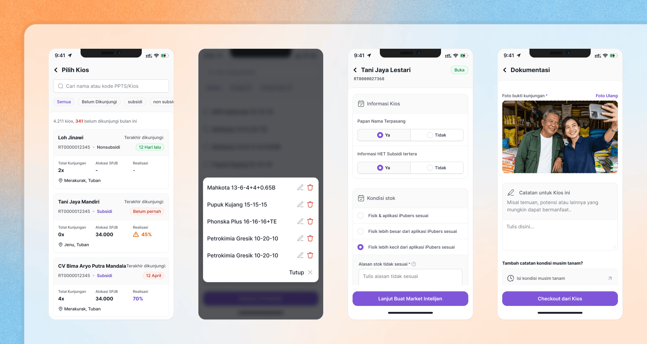
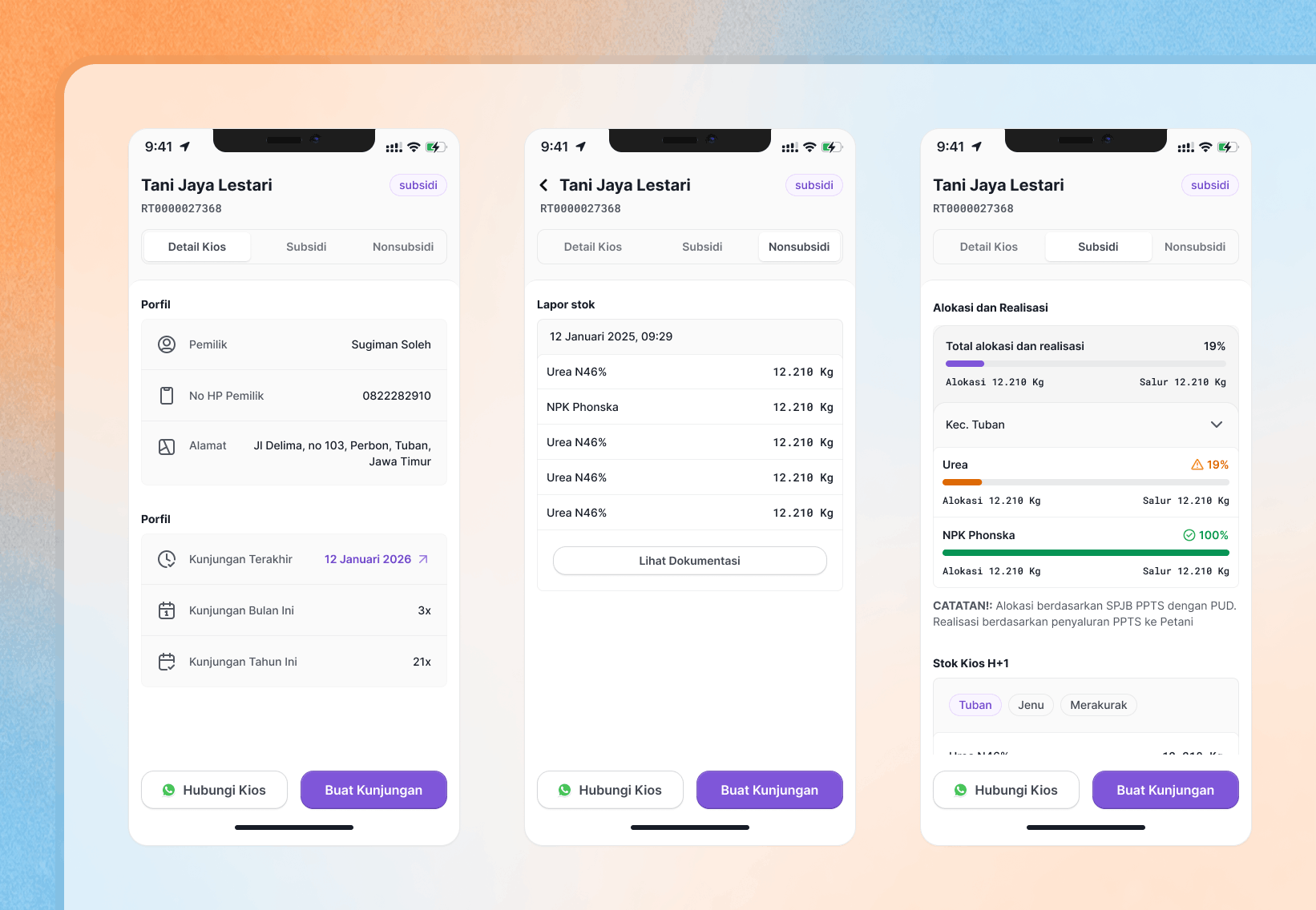
We assumed the hard problem was market research — the core reason the app exists. It wasn't. As we sat with the field teams, a second, quieter job kept surfacing: making sure the administration of subsidized fertilizer moved without friction. Account executives weren't just gathering market insight; they were the human safeguard making sure subsidized product actually reached the kiosks, distributors, and warehouses it was meant to reach, with the paperwork (tracked through iPubers) clean and current.
That second job was invisible in the old app. Nobody had designed for it, so nobody could see it. And what you can't see, you can't manage.
This reframed the product. Numi wasn't only a research tool — it was a coverage and compliance tool wearing a research tool's clothes. That realization changed what we built next.
Designing for the morning, not the spreadsheet
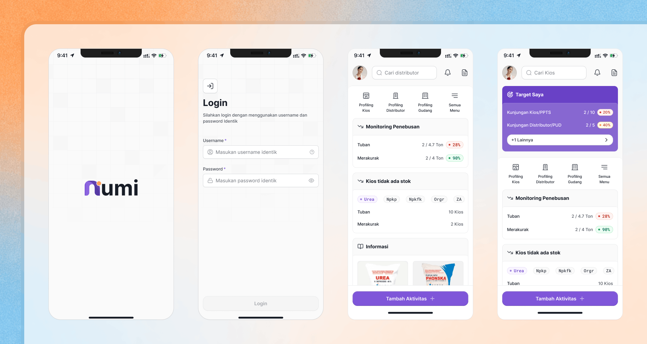
The center of the mobile experience is the moment the app opens.
When a user launches Numi, they don't land on a menu or a dashboard of charts. They land on today — the specific tasks their regional manager has already assigned, laid out so the next action is obvious. Tap to start. Watch the progress bar move as you go. No hunting, no setup, no deciding what to work on. The app makes the decision for you, because decision fatigue is the silent killer of field-team consistency.
Every task in Numi is a real, structured field report — a monitoring check on a kiosk, a distributor, or a warehouse. By making the act of reporting feel like completing today's work rather than filling out a form, we turned a compliance chore into a momentum loop.
Mini Insight: making coverage visible
The feature I'm most proud of came directly from that second-job realization.
We called it Mini Insight. The problem it solves is deceptively plain: how does anyone know that every kiosk in a territory is actually being watched? Coverage is easy to assume and hard to prove. A kiosk that goes unvisited for weeks isn't a data point that screams; it's an absence, and absences are invisible by default.
Mini Insight makes that absence loud. It surfaces, at a glance, whether the kiosks under an account executive's care are on track or slipping — turning "I think we've got it covered" into "here's exactly what's covered and what isn't."
Small feature. Outsized effect. It's the difference between a manager hoping the territory is healthy and a manager knowing.
Building the dashboard, not just designing it
My role didn't stop at the mobile designs. I also took the reporting dashboard from concept to working frontend — vibecoding the interface that turns thousands of individual field reports into something a regional manager, and eventually leadership, can read in seconds.
The design principle carried straight through from mobile to desktop: lead with target, support with task. The same discipline that kept the mobile home screen focused kept the dashboard from becoming the wall of charts that Markisa never managed to be useful as.
Owning both ends — the field-facing app and the management-facing dashboard — meant the data model stayed honest. What an account executive logs in the morning is exactly what their manager sees by the afternoon, with no translation layer guessing at intent.
What changed
- From data store to daily ritual. Markisa held information; Numi shapes a workday. The redesign reframed reporting as "finishing today" rather than "feeding a database."
- Coverage you can prove. Mini Insight converted an invisible risk — unmonitored kiosks — into a metric managers can act on.
- One coherent surface, two audiences. Field teams and managers now work from the same target-and-task spine, on mobile and dashboard, designed and built end to end.
What I'd want you to take from this
First, I design from the job, not the feature. "Target and task" wasn't in any brief — it was the sentence underneath everything the field teams were already doing. Good product work is usually less about adding and more about finding the spine that's already there and refusing to bury it.
Second, I ship, not just spec. I designed the mobile experience and coded the reporting dashboard — closing the gap between what was imagined and what actually runs.
Numi is a simple promise kept simple: open the app, know what to do, know if you're winning.