



Rekanesia
A multi-brand design system built from a single painful screen change — one source of truth that lets one product become many brands across Figma, web, and native.
The core idea, in one line
Rekanesia is a single source of truth that lets one product become many brands — across Figma, web, and native — without losing its soul or rebuilding from scratch.
That sentence is the whole story. Everything below is the evidence behind it.
The day a button took a week
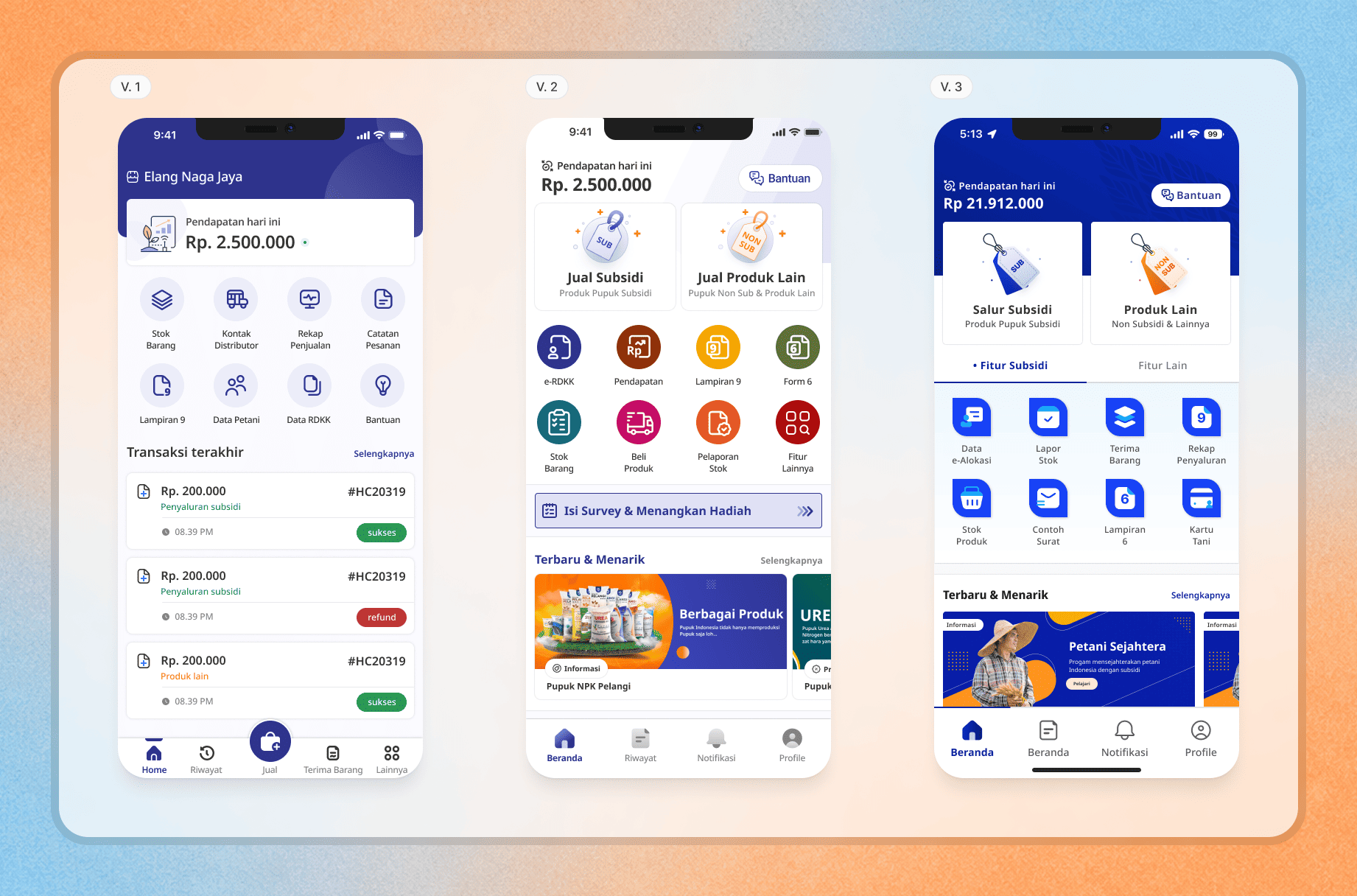
In 2021 I was designing Rekan POS, and I didn't think about design systems at all. Then the product scaled.
One day I was asked to change a single element. A small thing. And it was brutal. The same component lived in dozens of places, each one slightly different, each one needing to be found and fixed by hand. A change that should have taken minutes ate days.
A mentor said the thing I needed to hear: the smoothness you feel now is debt you haven't paid yet. That sentence is the reason Rekanesia exists.
Why this matters to a business: design debt is invisible until you scale, and then it taxes every release. This work is, at its heart, about removing that tax permanently.
Earning the right to a system
I didn't start by designing a system. I started by auditing one.
I went back through every screen I had already shipped and made an inventory: which elements actually repeated, how often, and how much logic each one carried. Then I ranked them.
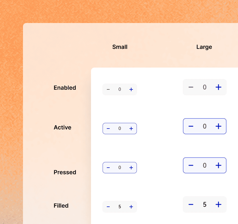
The winner surprised me: the Stepper — a numeric input for quantities. It looked humble, but it was the most-used and most logic-heavy component in the app. It had variants, multiple states, default values, and preset quantities tied to real product packaging — 50 kg, 30 kg, the actual bag sizes a kiosk sells. Getting the Stepper right meant understanding the business, not just the pixels.
The lesson: a design system isn't a land-grab. You earn it one high-leverage component at a time, starting with the one that hurts most.
The seven-day rebrand (delivered in two)
In 2022, Rekan got noticed — by the Indonesian Ministry of Agriculture.
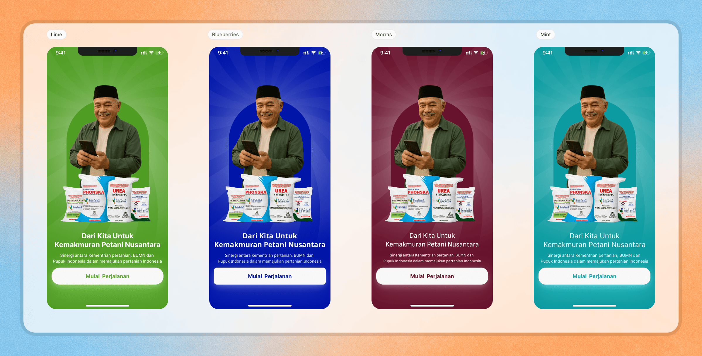
Because the app was already in the hands of 28,000 kiosks, it became the natural choice to administer the national subsidized-fertilizer program. The decision: rebrand Rekan into iPubers, a joint initiative between Pupuk Indonesia and the Indonesian government.
The catch: rebrand the entire app in seven days. Design to release.
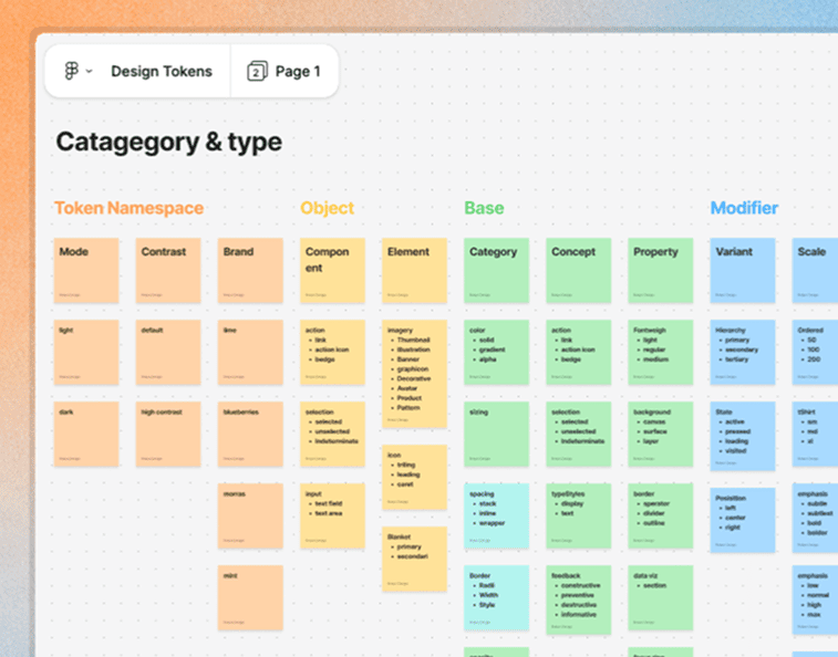
I treated it like a strategic choice. Duplicate every asset and recolor them? Fast to start, impossible to maintain. Rebuild from scratch? No chance in seven days. The third path was the unlock: I converted the foundation to a variable-based design token model and turned theming into a property of the system rather than a manual repaint.
The result: I presented the full rebrand and handed off to development on day two of a seven-day window. The rest of the week was margin, not panic.
Credit: @taufik, an intern at the time, helped define the new color set and transform brand assets from PNG into clean vectors.
The reframe: the deadline didn't make me work faster. It made me change the architecture so the work got smaller.
Defining the DNA
By v3, the question changed — from "how do we switch themes?" to "how do we make sure Rekanesia's soul survives across every brand?"
Three principles now govern every build and every maintenance decision:
Accessible — the system has to work for every user and the realities they operate in: small screens, low-end devices, and the constraints of a kiosk counter, not a design studio.
Achievable — the system should make the right thing the easy thing. The path of least resistance should also be the correct, on-brand path.
Scalable — every decision is made as if a fourth, fifth, and sixth brand are coming. Tokens, naming, and structure are designed to extend, not to be rewritten.
Turning Figma into code, automatically
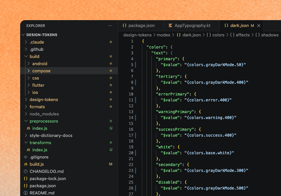
A design system that lives only in Figma is a suggestion. To make it the real source of truth, I built a pipeline that carries a single change all the way to production:
Update a variable in Figma → sync through Token Studio → commit to GitHub → run Style Dictionary → deploy to CDN on Google Cloud.
One edit at the source, propagated everywhere, with no human re-typing values into code.
Credit: @hilal helped research and stand up this pipeline.
Rekanesia in the AI era
v4 is an honest chapter.
As the team got leaner, I made a deliberate call: lean on component libraries already stable in code, and keep a custom design-token layer on top. Working from code taught me how much bigger the token universe is than Figma ever let it be — tokens for overflow behavior, perspective, transitions, and breakpoints: whole categories Figma's model simply can't represent.
That reframing pointed at where Rekanesia goes next:
A code-first, multi-platform token engine. Rebuilt to be DTCG-compliant and compile from one JSON source to five platforms at once — Flutter, Jetpack Compose, CSS, Android XML, and iOS Swift — using Style Dictionary 5 with a GitHub Actions pipeline that publishes automatically on every push.
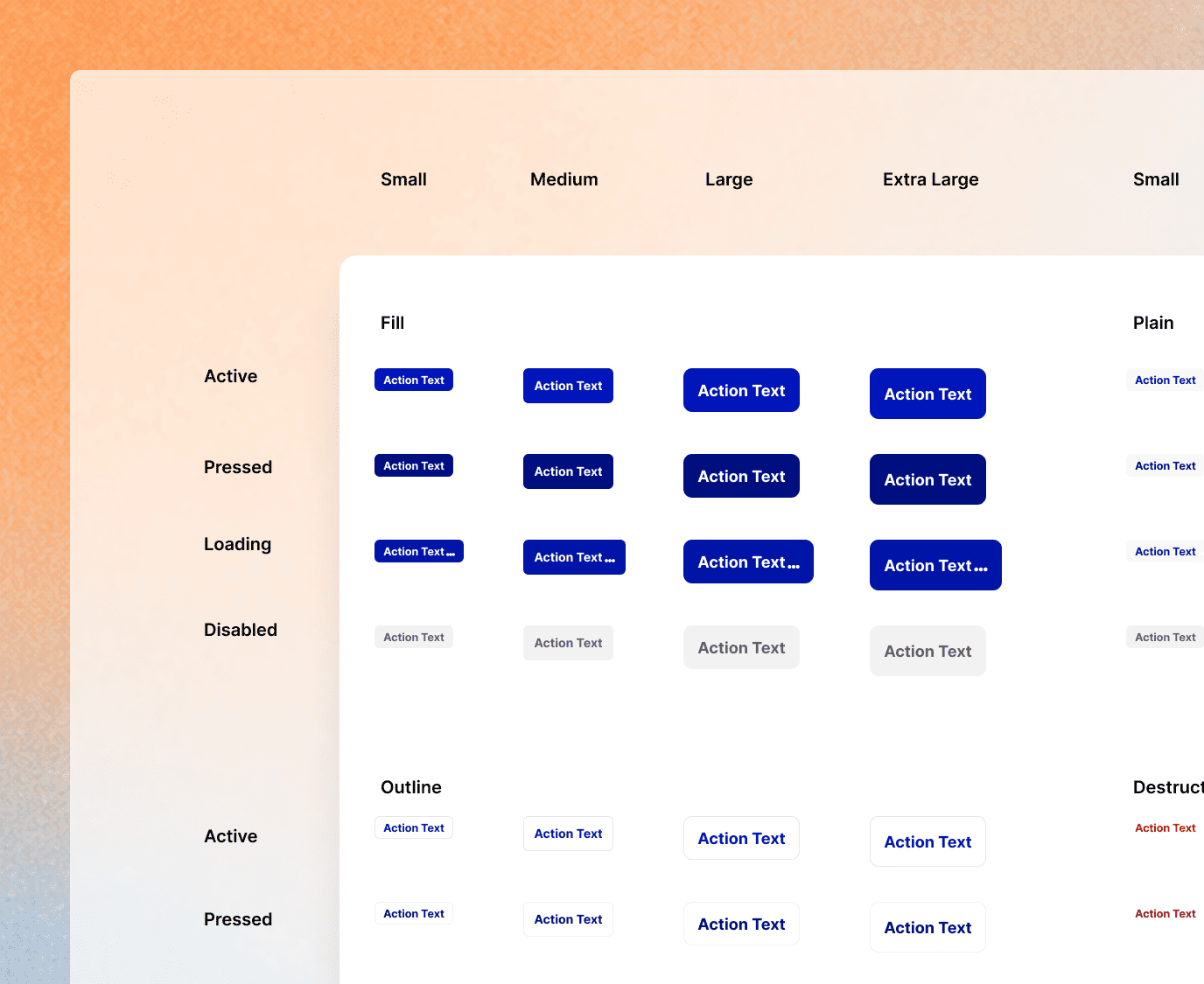
Native components, driven entirely by tokens. A working Jetpack Compose prototype renders 30 components that re-skin into 5 completely different brands at runtime by swapping a single parameter. No component code changes.
A production web library. Built on accessible primitives (React Aria approach) and styled with Tailwind — @rekanesia/ui, a React component library with ~37 components, published and installable like any real package.
SKILLS.md — documentation an AI can actually follow. Structured so that when an LLM builds with Rekanesia, it produces consistent, on-system output instead of guesses.
v4 is the bet that the next decade of UI gets assembled by humans and machines — and that whoever owns the source of truth owns the consistency.
What I actually learned
The most valuable thing Rekanesia gave me wasn't a component library. It was a way of thinking.
Working through design tokens — naming, layering, versioning, making sure the smallest unit is correct so the largest structure can hold — quietly rewired how I approach everything with structure. Systems thinking stopped being a design skill and became how I work.
The short version
I took a product buckling under its own success and turned it into a system that turns chaos into a property you can toggle. When a national program demanded a full rebrand in a week, the system answered in two days. When new products needed to exist, the system spun them up.
One source of truth. Many brands. No rebuilds.
Acknowledgements: @taufik (brand color definition and asset vectorization during the iPubers rebrand) and @hilal (design-token pipeline research).